Minimal House - Casa Mínima

Cubo2.jpg

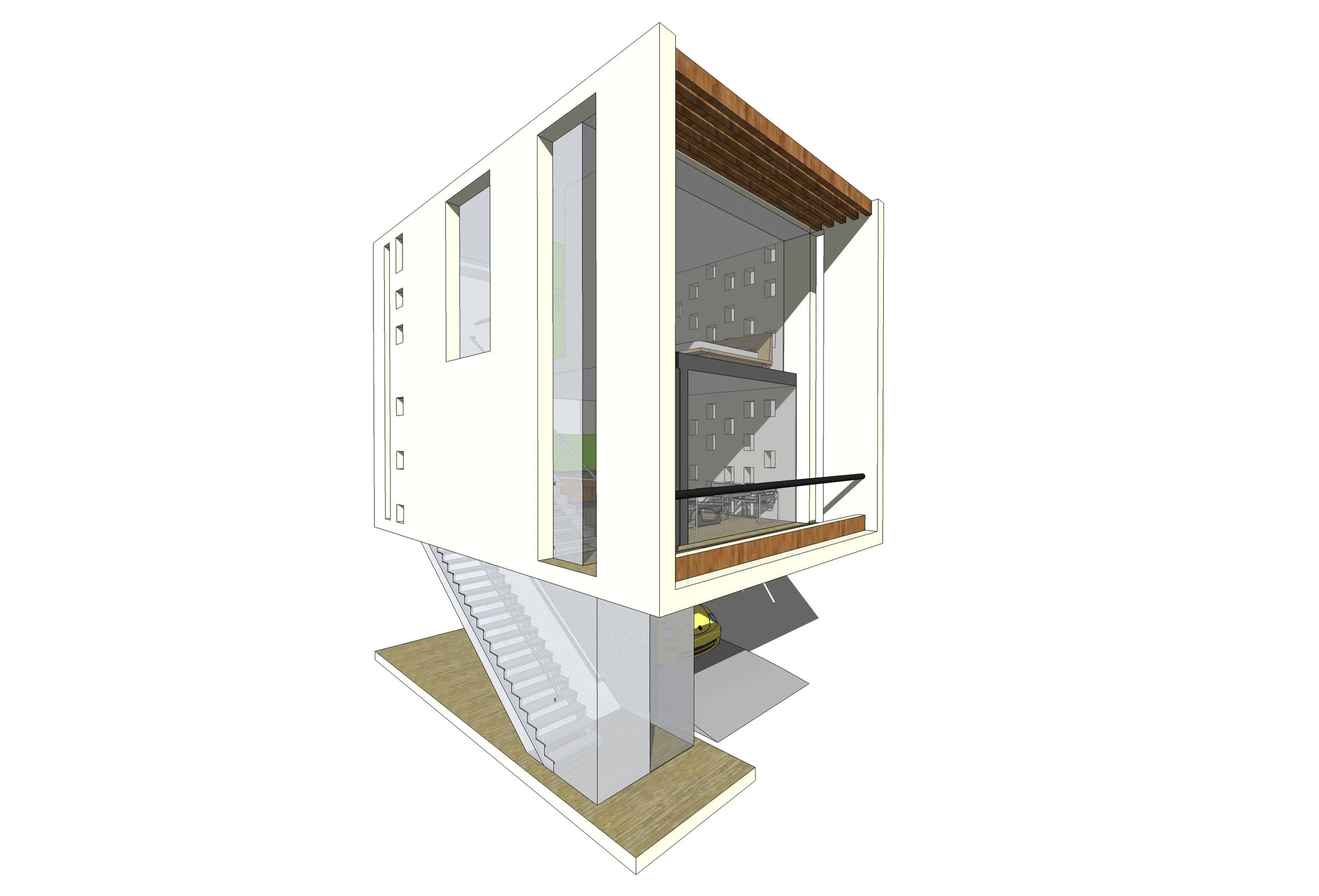
This excersise focused on creating a very small living unit using modern design concepts and materials. This excersise is part of the Cube series (more on future posts) so it had to be housed inside a cube like structure.

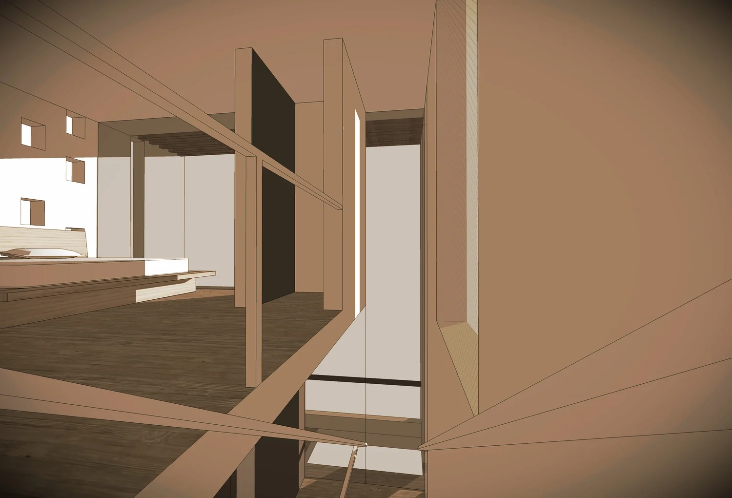
The house has a parking space (for a car, bikes or a boat), on the first floor. The second floor has the social area and has a balcony, a living room and an open kitchen with a bar. The third floor has the provate areas so it has 1 bedroom and a full bathroom that can also be used for guests.

This house is a consmopolitan modern loft that can even be movable and transportable.


Czech Republic Public Library Competition - Concurso para la Biblioteca Pública de la Republica Checa

This is another competition that I worked with Jesus Jauregui. This time the entry was under my name. The design turned out pretty interesting and we where competing with the big guys internationally. 

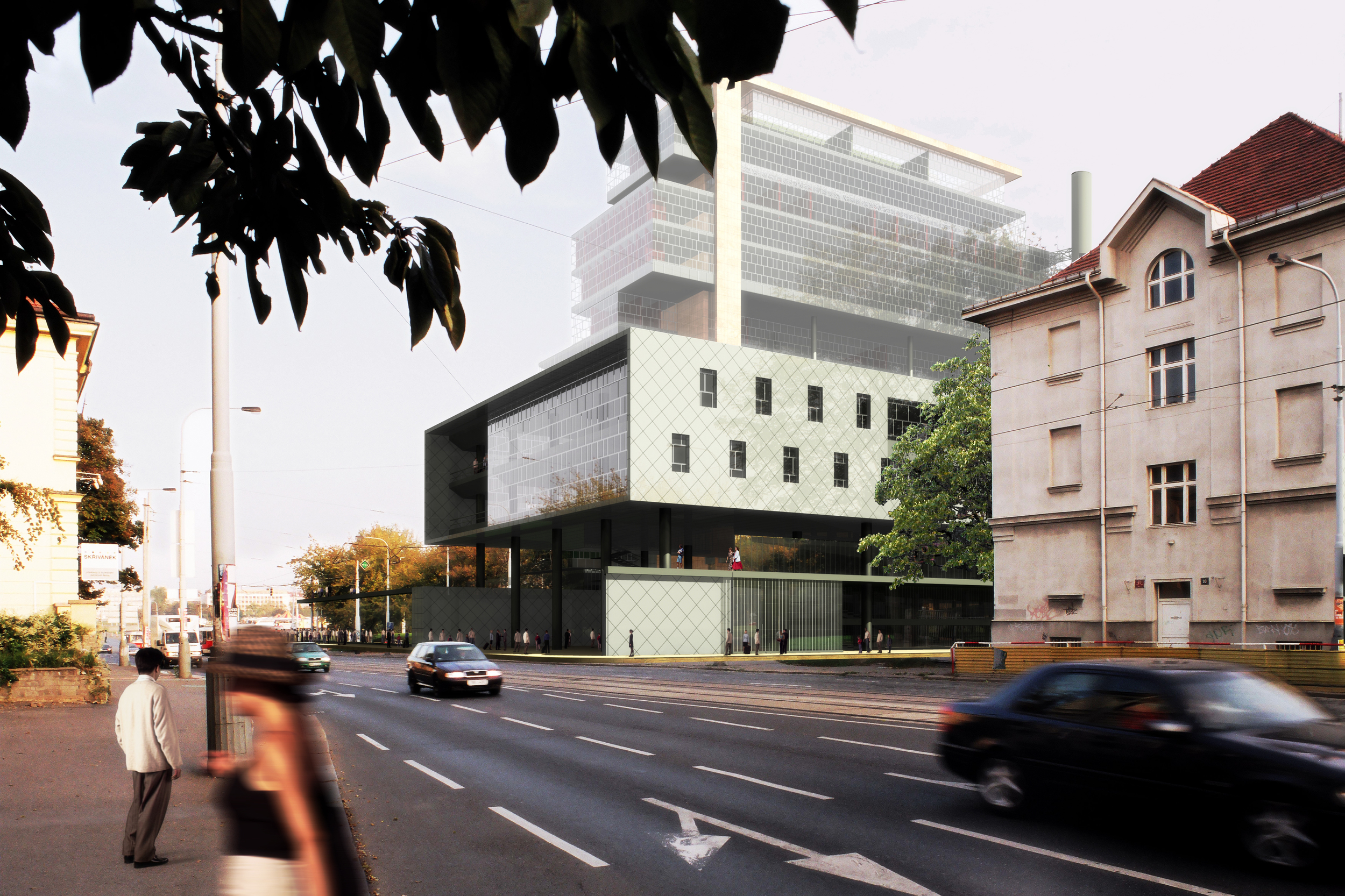
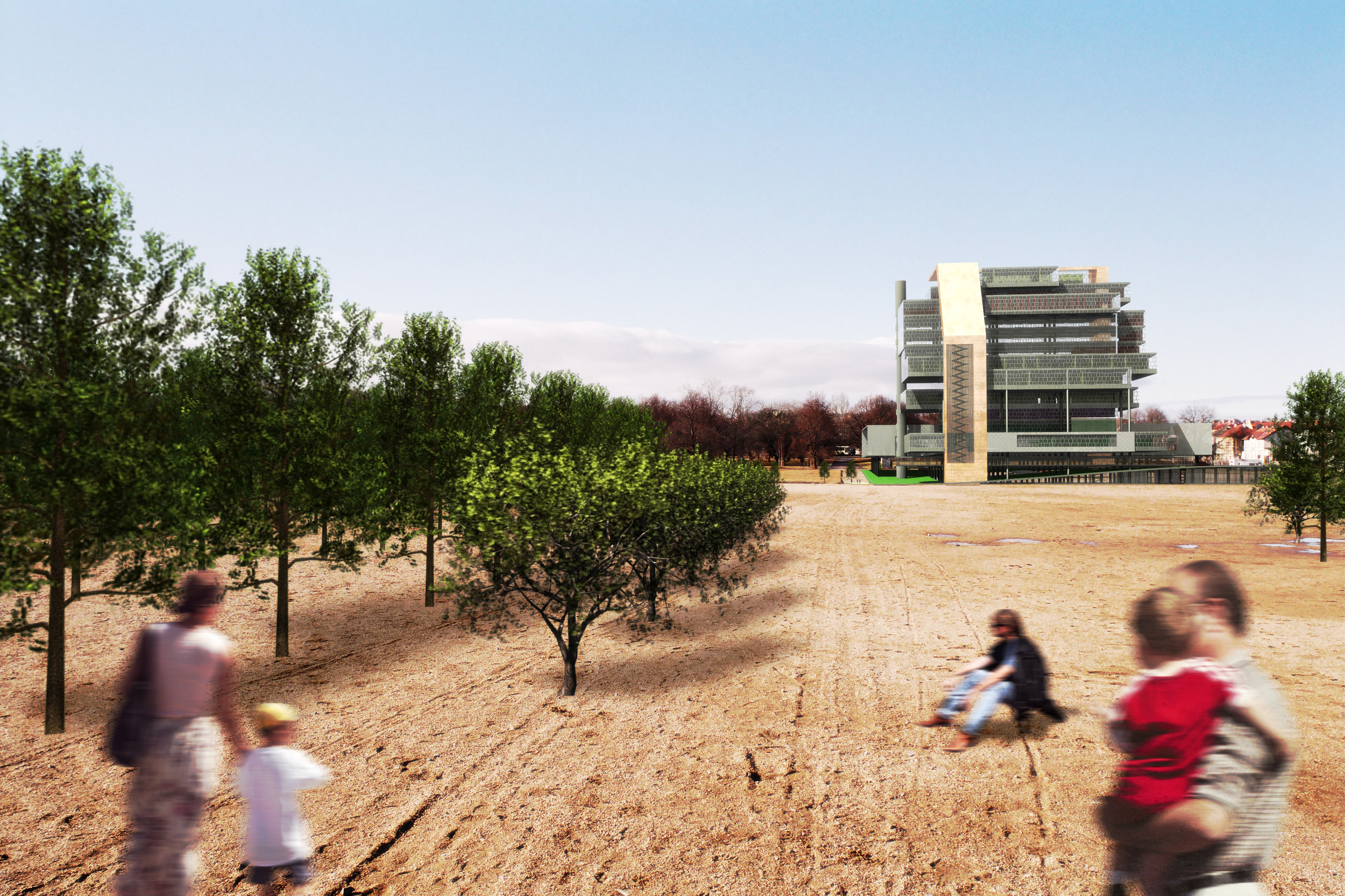
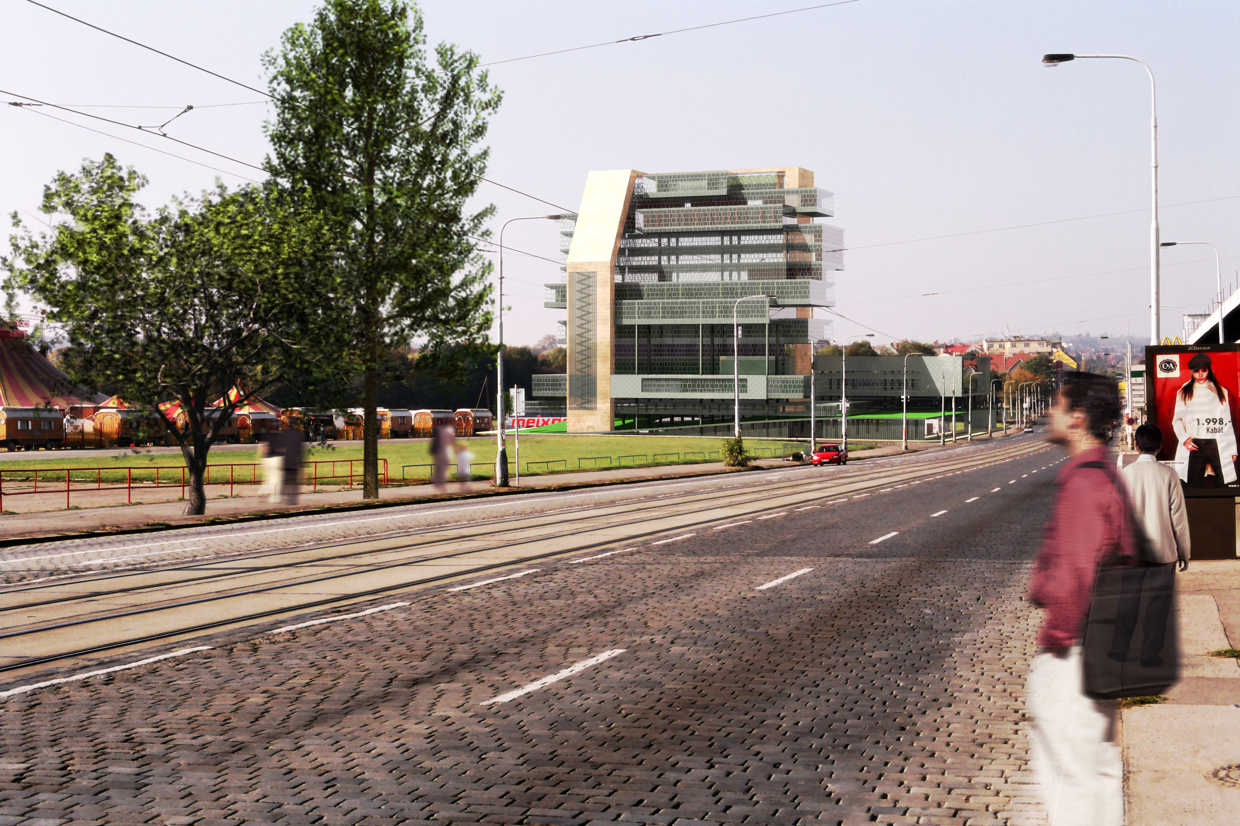
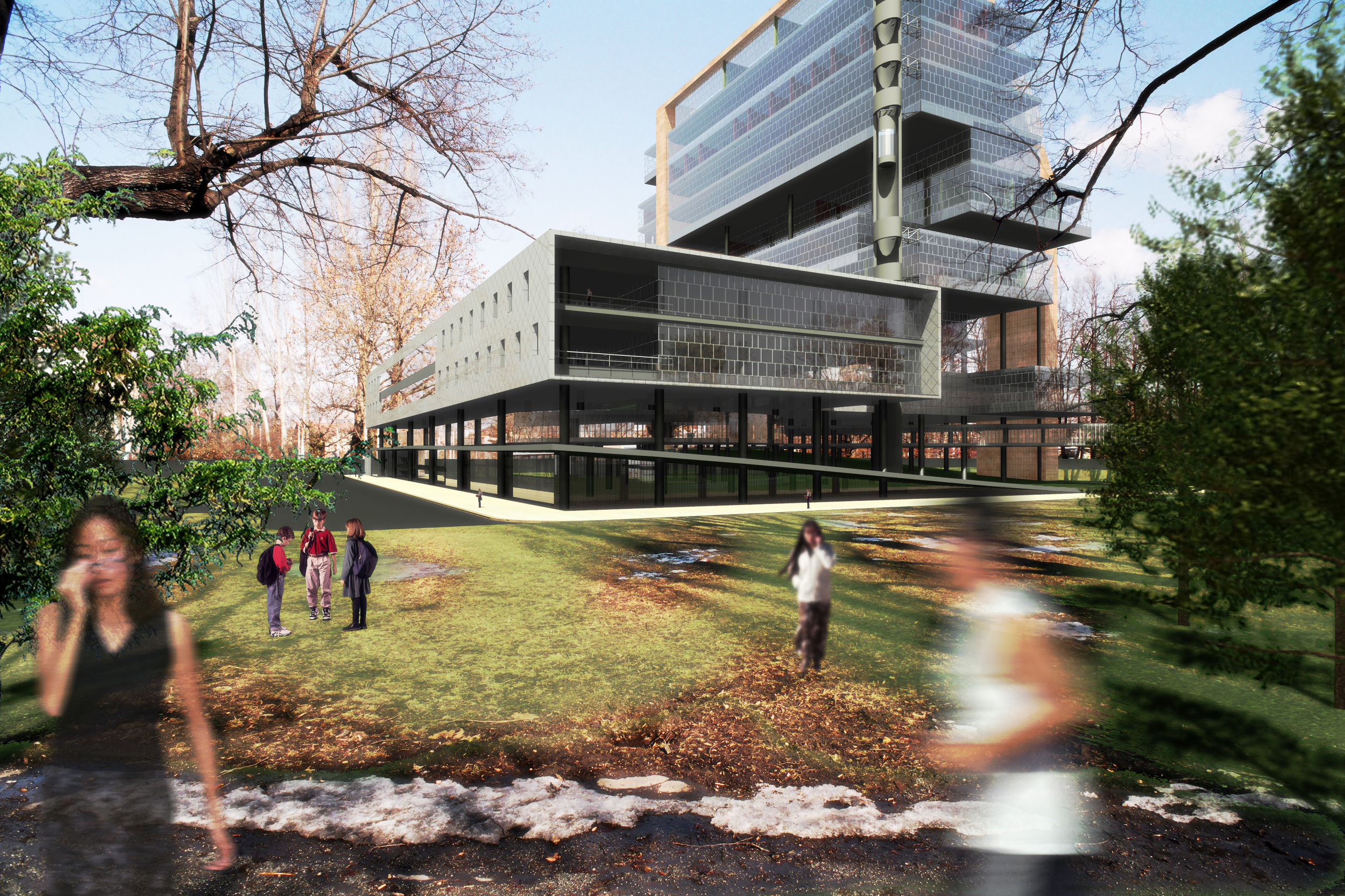
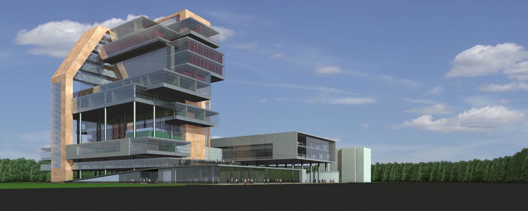
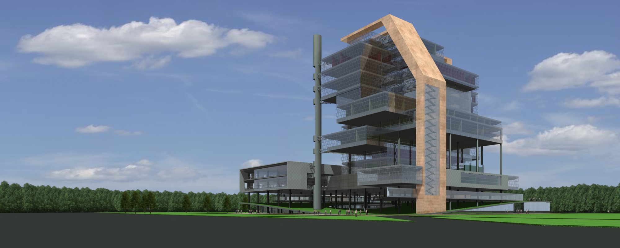
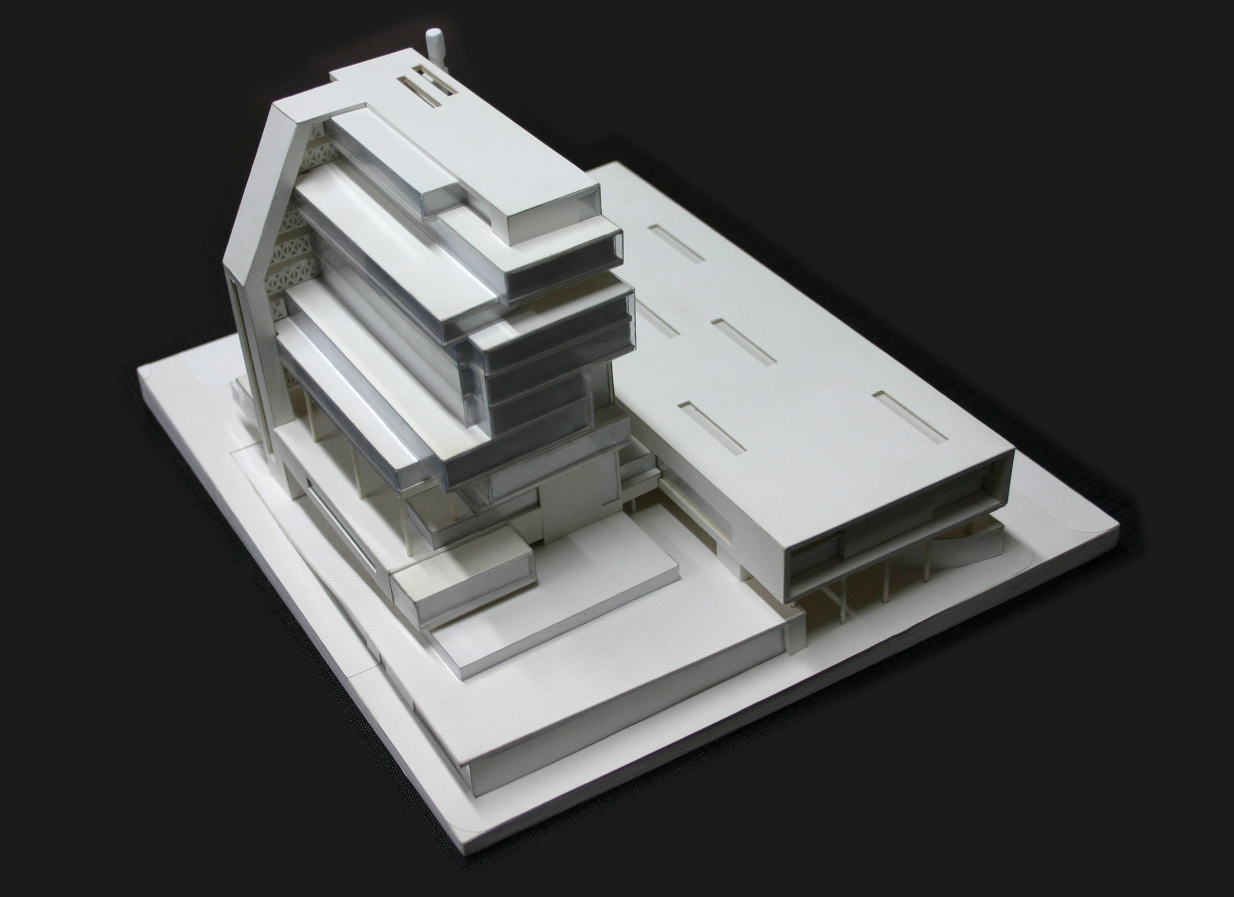
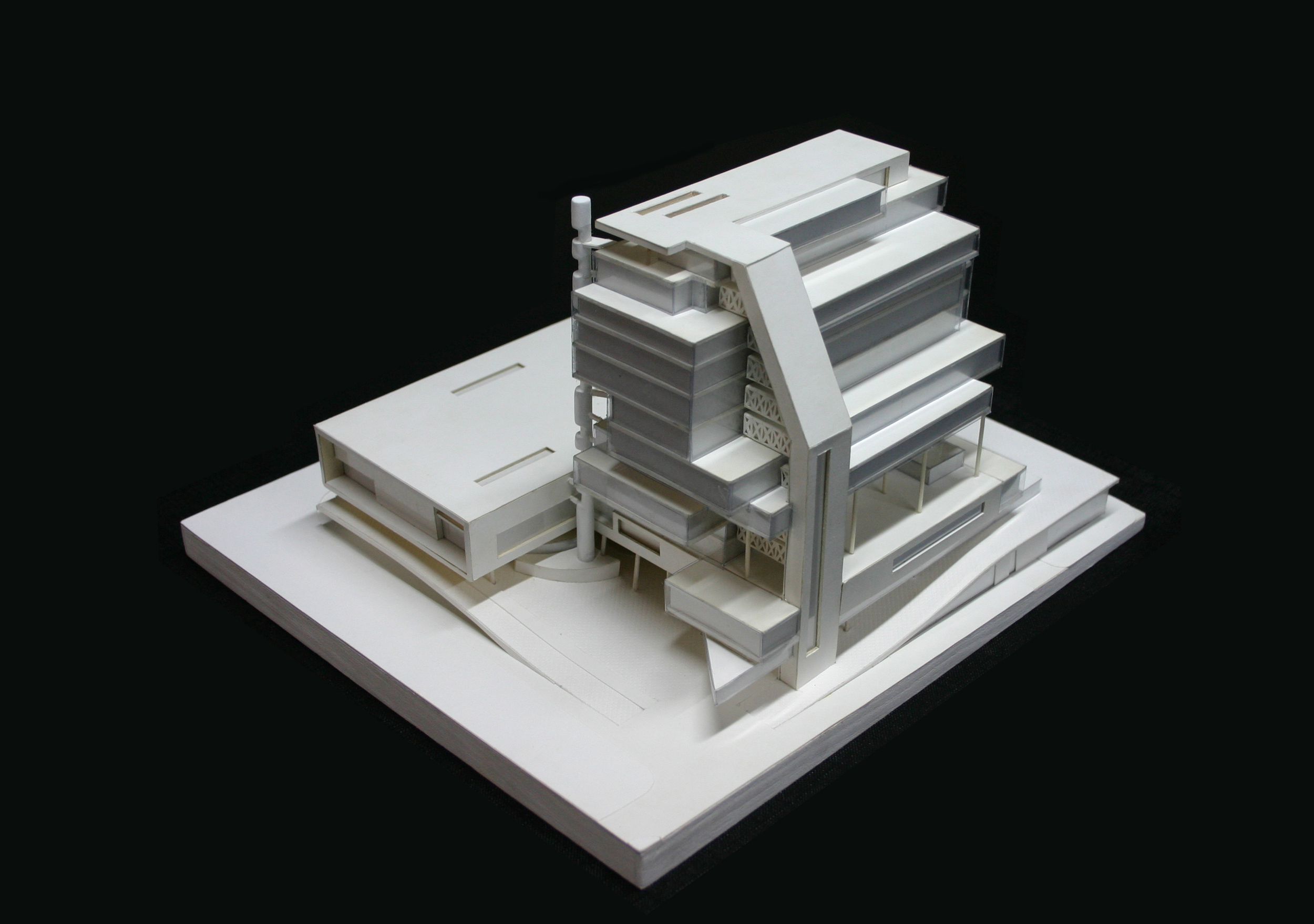
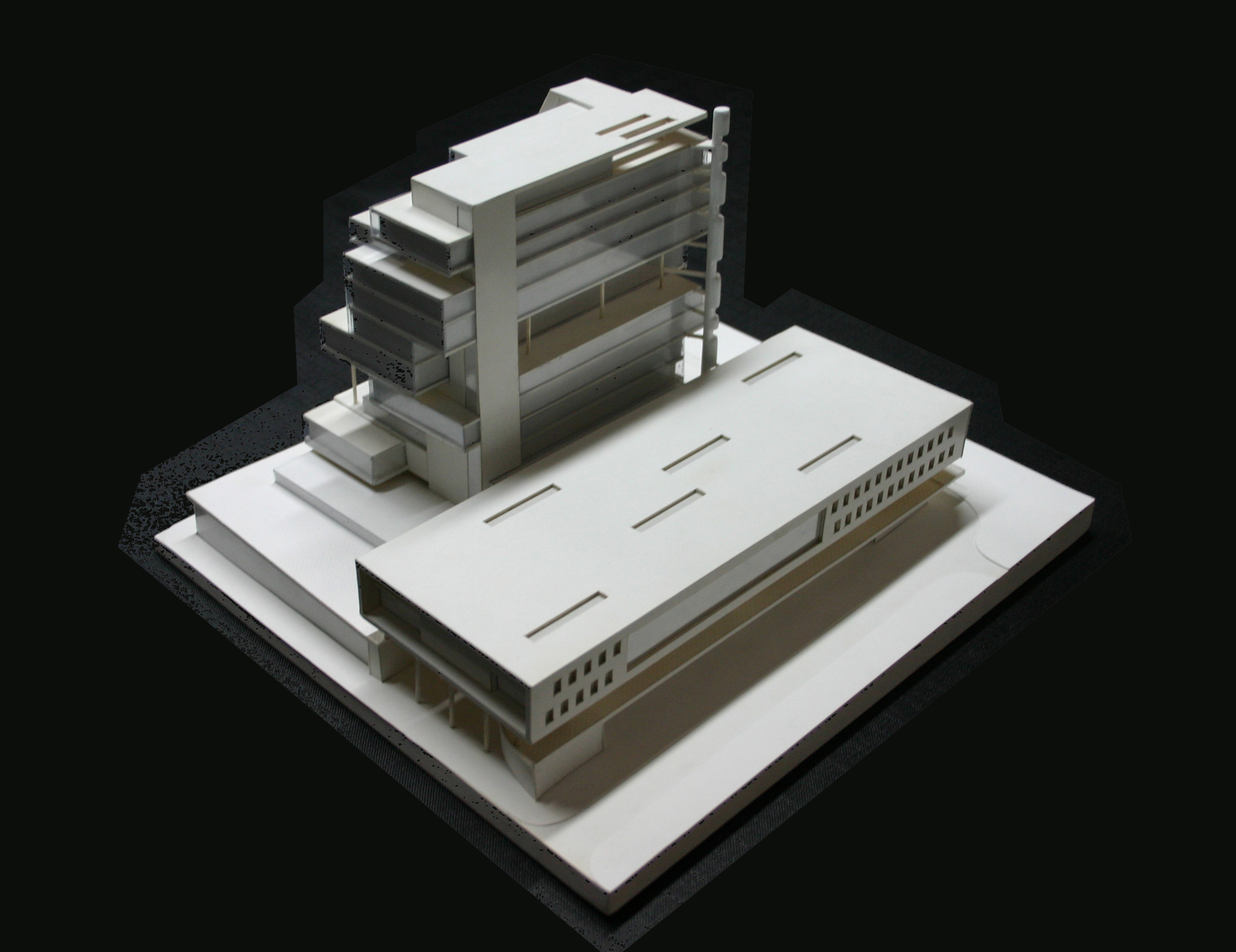
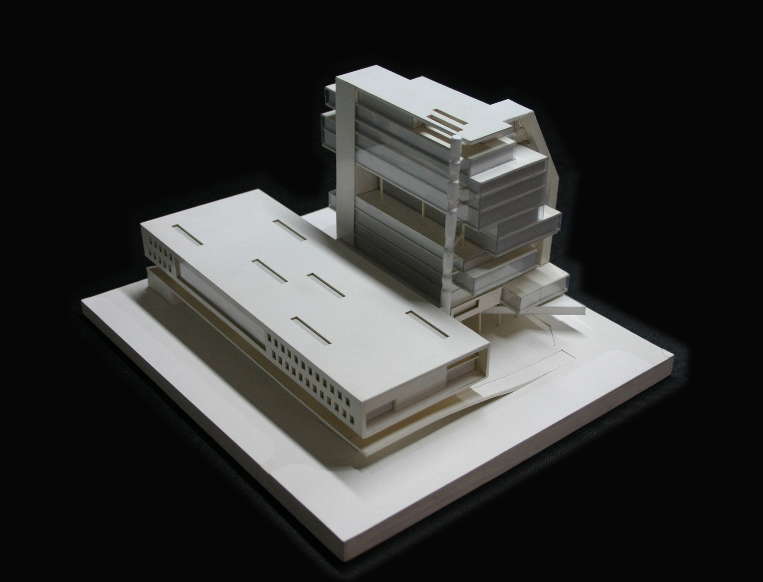
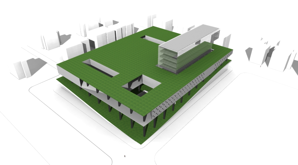
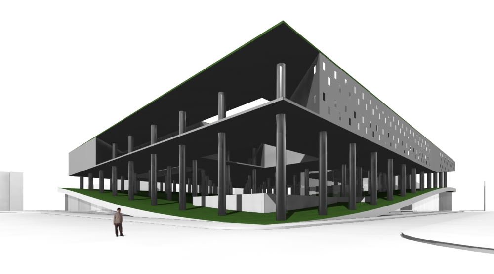
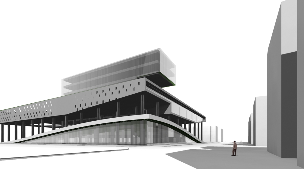
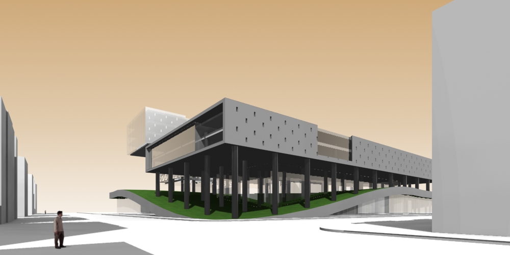
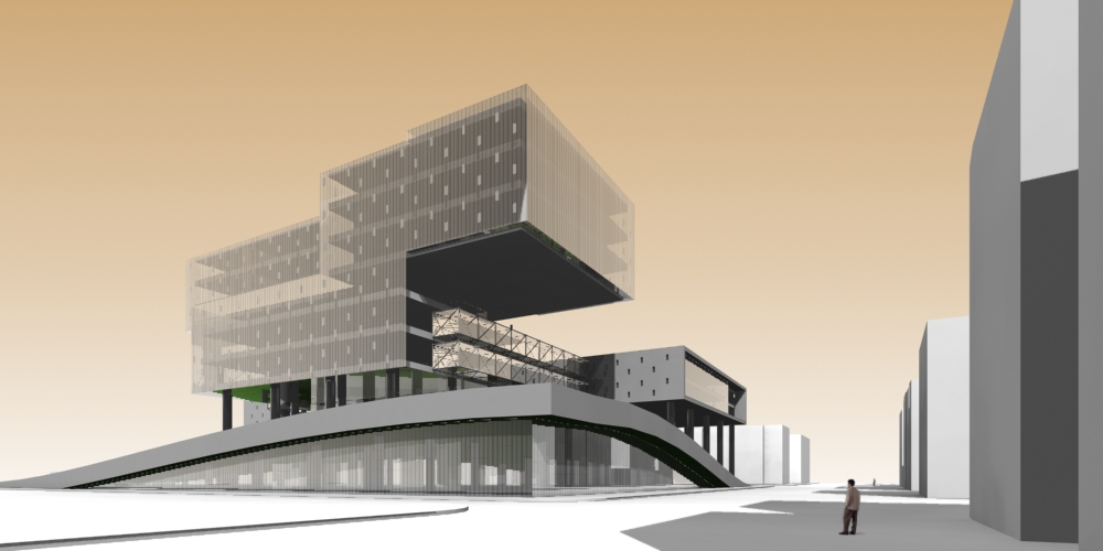
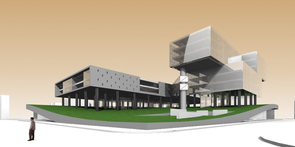
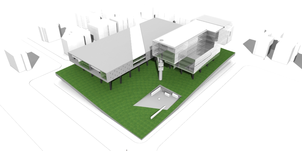
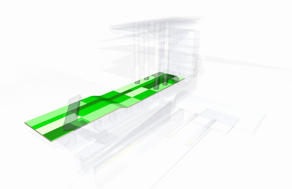
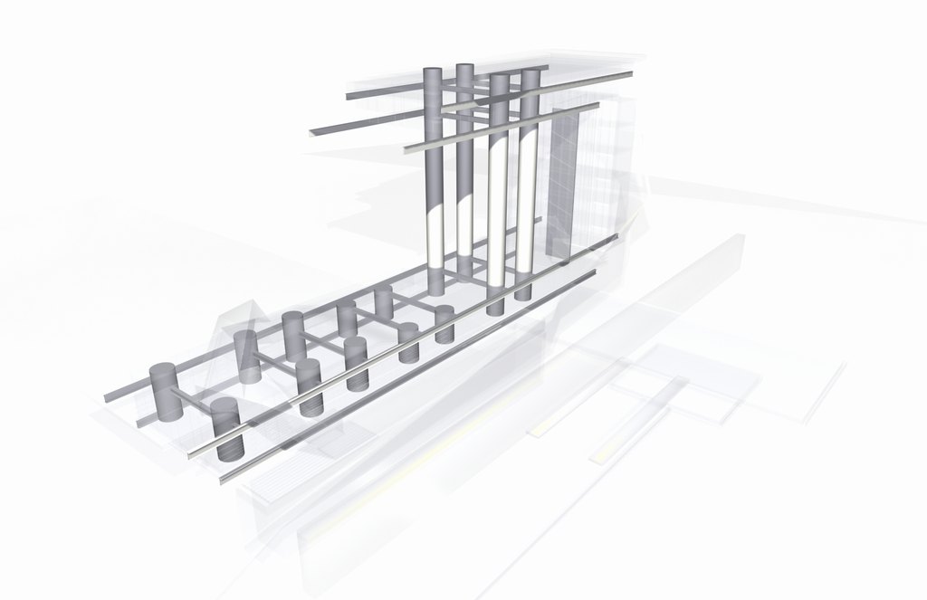
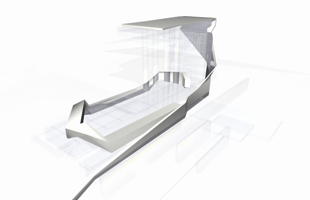
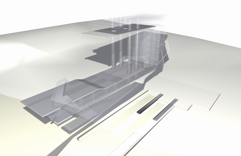
The main idea was to integrate the public library floors with the park behind and to create a walk-able park on top of the public space. This the concept was divided in two : the public library slabs, which had a folded membrane as a roof that integrated with the park. and the office and research building, whose form was abstracted form a stack of books. 

The library is located in a very traditional part of Prague so the first level somehow tries to mimic the facade qualities of the buildings next to it. The design tries to invade as litte as possible the urban context to all the tall structures are pushed back to allow for a breathable public area.

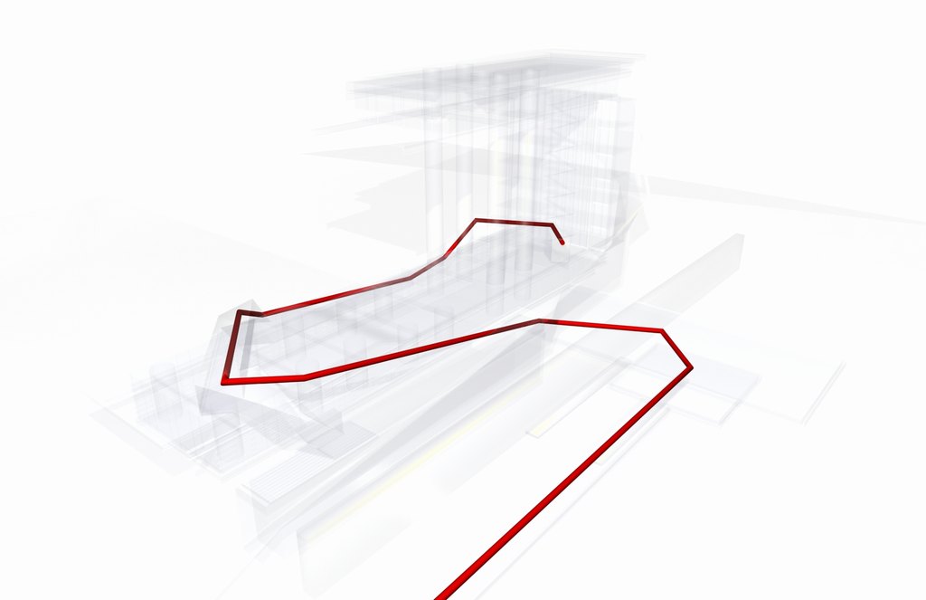
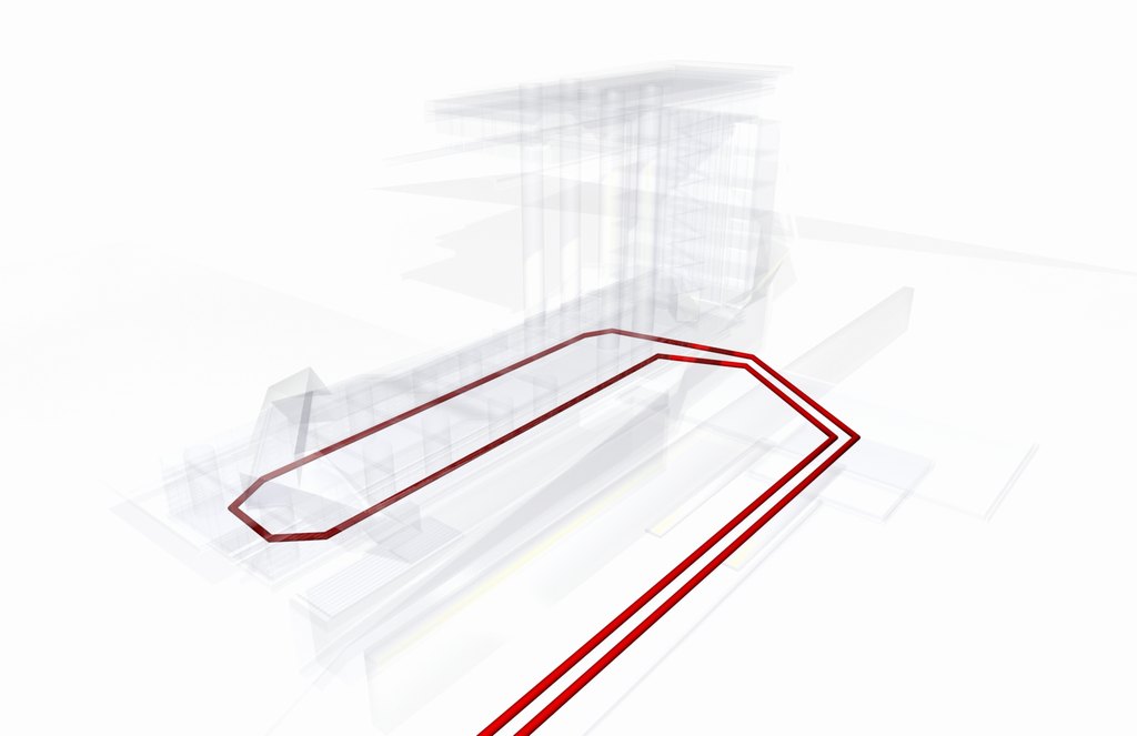
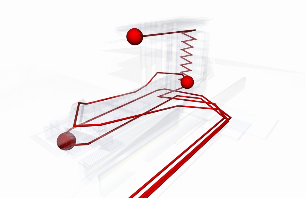
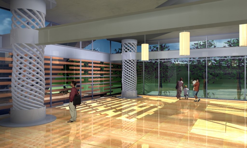
Inside, ramps and walkways in double, triple and cuadruple height spaces controlled the public flow alowing for a very dynamic bluildinng. Of course the competition entry had many versions before the final one (version 3).

DIfferent Versions before the final one:

Seventh day Adventist Church Temple for the UPEU - Templo para la iglesia Adventistas de la UPEU

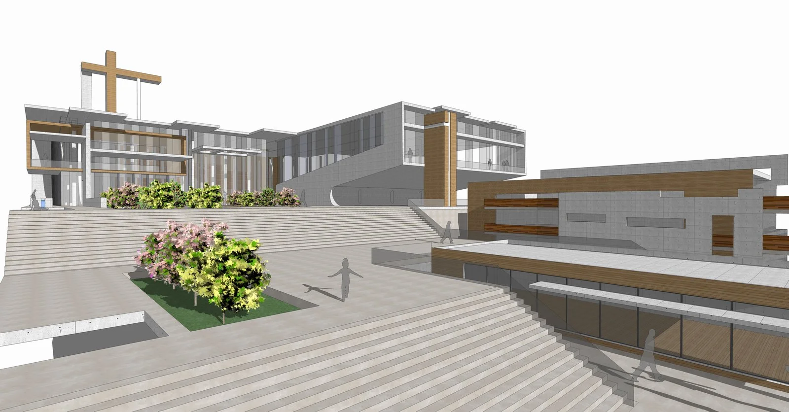
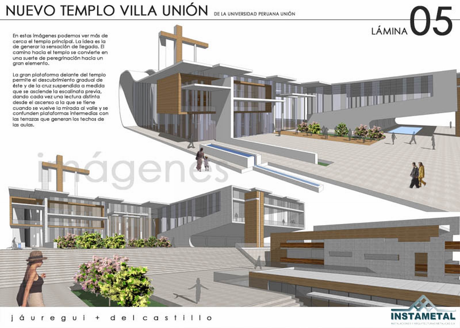
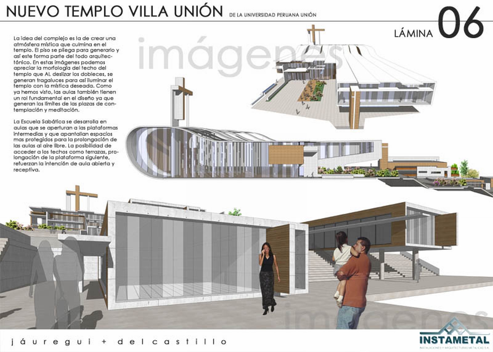
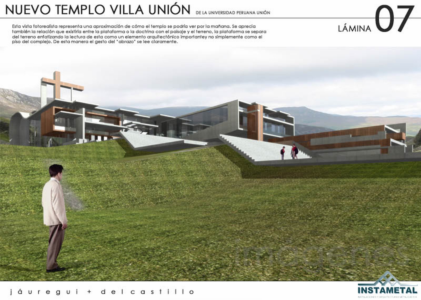
Firstly i have to state that I am not an Adventist, I was invited, as an Architect, to participate in a closed private competition for the design of their main temple in Lima, Peru inside the campus of the Adventist University UPEU (Universidad Peruana Union.

Since last post it seemed like a good idea to keep the church theme (I've designed a few). This project was co-designed with my friend and colleague Jesus Jauregui and was presented through his firm Instametal.
The church required us to do extensive research on Adventist ways and ceremonies and required to fulfill an huge program requiring classrooms to prepare the believers for the second coming of Jesus Christ.

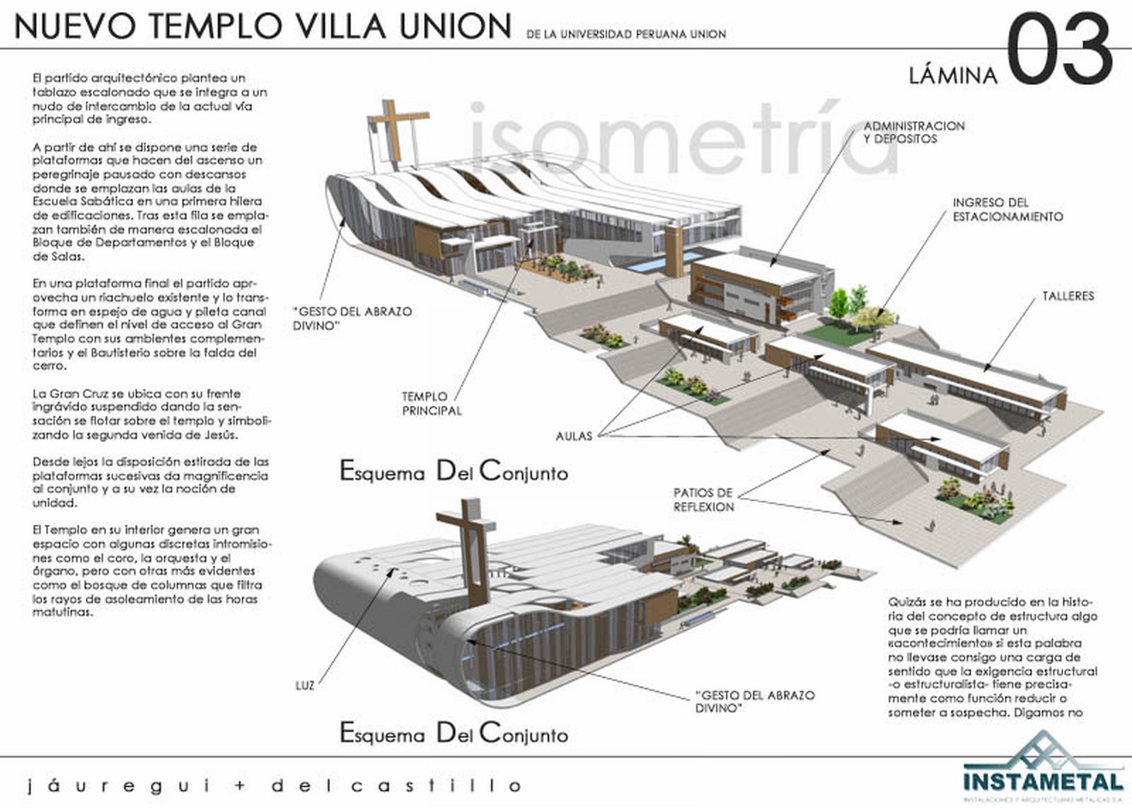
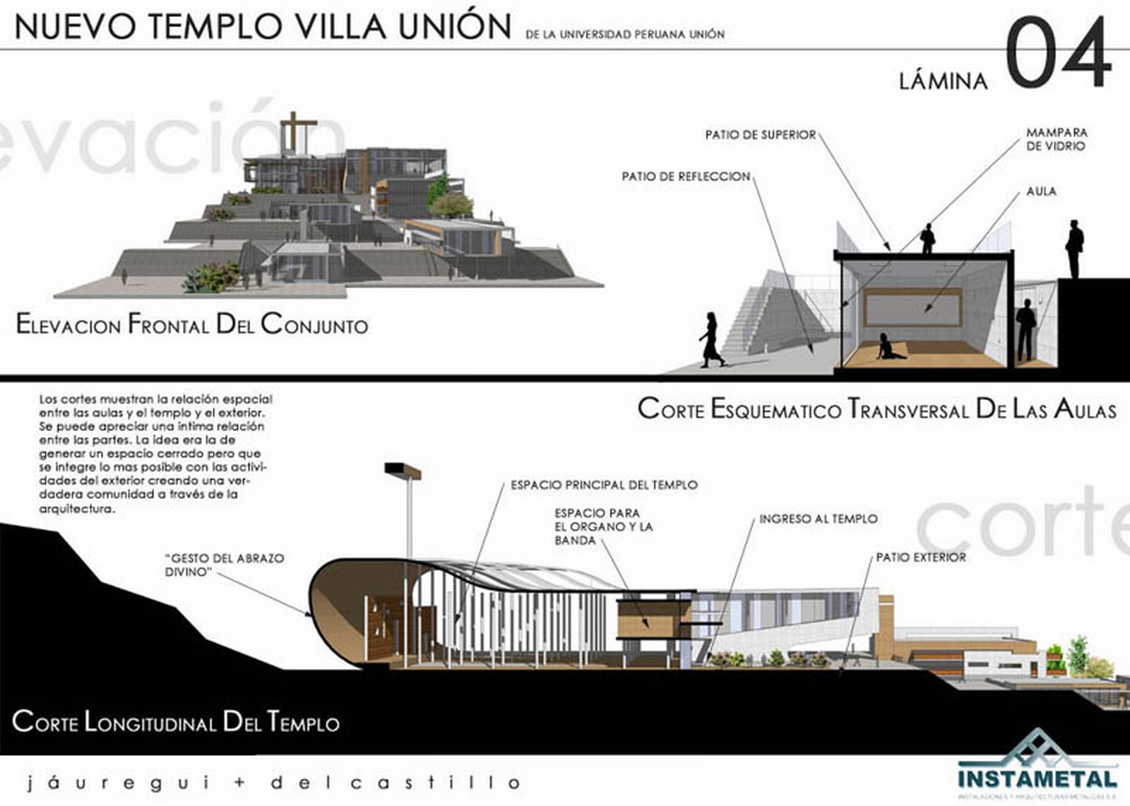
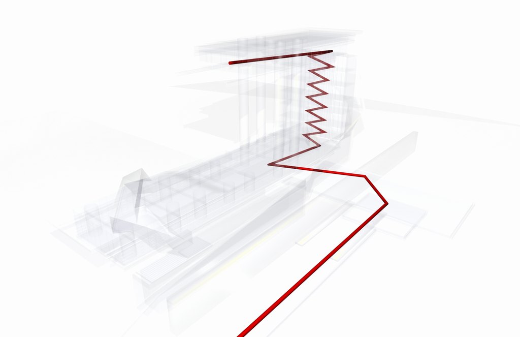
The lot was uphill and the sequence of spaces is akin to the sequence of ceremonies the Adventists participate in.

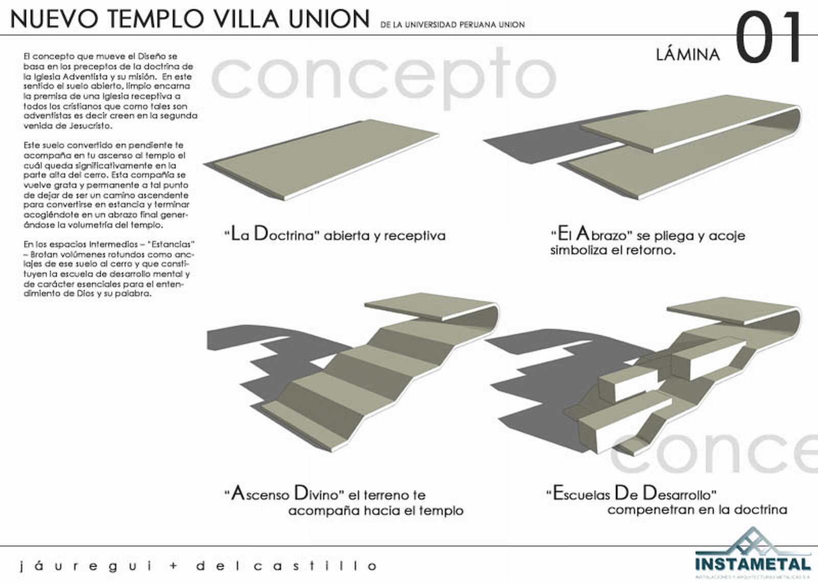
The concept started as a giant slab that bends in itself creating the closure for the shape of the church. In a was this was viewed as a "hug" in the same way the church welcomes their believers.

Here you can fin the panels the project was presented in (in Spanish)

The Museum of God - Museo de Dios

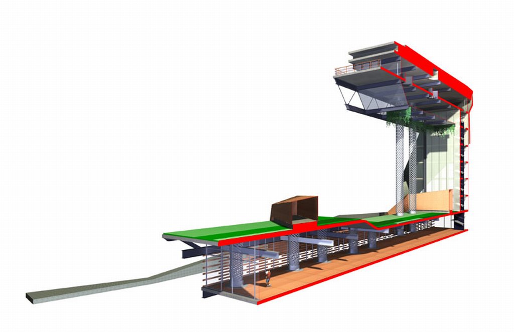
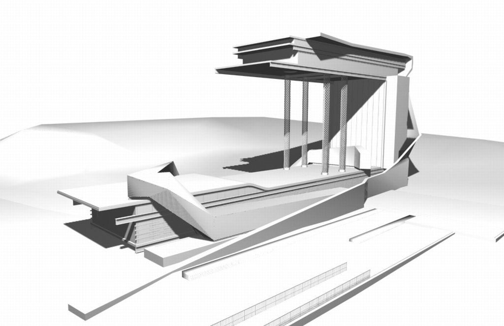
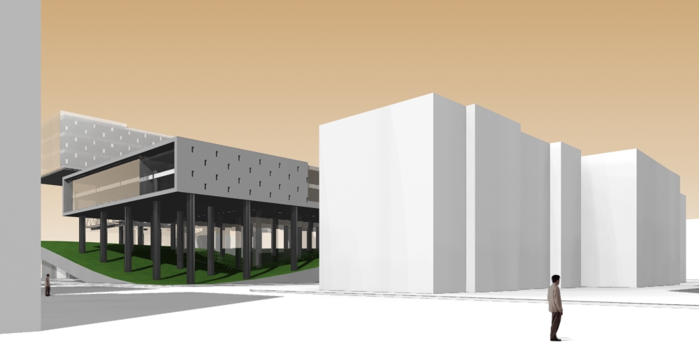
The Museum of God was a submission for an international design competition. The idea was to create an architectural marvel in a fashion that it would rival the ancient cathedrals becoming a modern icon.

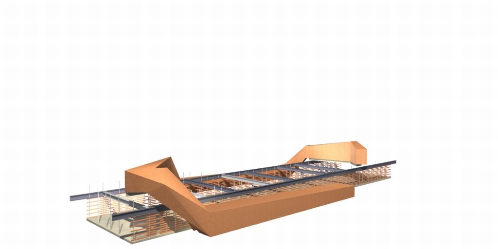
This museum is conceptualized to reflect our times in relation to the concept of god. The museum is organized through three paths : the path of the believer, the path of the atheist and the path of the skeptic.

The path of the believers is a staired path that reaches the top platform from which is the only place where one could see the unreachable roofed garden. This garden symbolizes Eden, a place to yearn, but a place one cannot reach.

The path of the skeptic is manifest as a squared section tube, clad in copper, that, as a gesture to the garden of Eden, crosses the building, as well as the garden. But this path has no windows, no light and is enclosed to the religious concepts of the building. Is is a walk-through path with a dead end.

The path of the atheist is a square glass hall, below the garden of Eden that serves as a lookout to the lake. It feels the garden presence above, but cannot see it but is still a serene environment. It comes out the same way it comes in.

The building, like a cathedral, amazes the passerby with its technical and structural achievements.

The entry was granted a special mention and earned the third place. It was very polemical and controversial.